
More Related Content
What's hot
What's hot (20)
Similar to Dps ps
Similar to Dps ps (20)
More from Gemma
More from Gemma (20)
Recently uploaded
Recently uploaded (20)
Dps ps
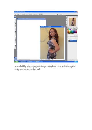
- 1. I started off by selecting my main image for my front cover and deleting the background with the select tool.
- 2. After deleting all the unwanted background I opened up a new page sized A4 and dragged and dropped the image on the new page.
- 3. After placing the image on the first layer I selected the background and changed the colour to a slightly lighter grey then the colour of her dress.
- 4. I then added a sky line on a separate layer. I went on to the dafont website and tried out a couple of different fonts before copying the font to a new layer.
- 5. I then selected the text and using the paint brush coloured in the selected part of the text in pink.
- 6. After that I right clicked the layer and outlined the title in black to make it stand out.
- 7. I still was not decided on the font so I tried out a few more and also changed the colour to pink.
- 8. I decided on this font instead and using the stroke tool added an outline to this title as well.
- 9. After deciding on the title I when to the main image layer and flipped the image so it as facing the other way.
- 10. I then added on the second part of the title and outline that with white and placed it below the original title.
- 11. Next I created the masthead by selecting the old English font and moving the layer down so the masthead would appear behind the main image.
- 12. Then using the text tool I added another layer and typed out the sky line positioning it on top of the black strip I made before.
- 13. I then started adding in the of cover articles that would feature on the magazine.
- 14. For one of the cover articles I had each word on a separate layer and using free transform moved the text around till I had the best fit.
- 15. I also changed the colour of the text to make it stand out and create a house style.
- 16. I carried on building up the title with individual layers.
- 17. Changing the font from bold, regular and italic.
- 18. I fond using different fonts made it more attractive and interesting.
- 19. Next I added in lines to break up the articles.
- 20. I adjusted the text size to create more room and keep the cover proportioned.
- 21. I added more cover lines in different ways, going down the page so the text doesn’t go over the image.
- 22. I adjusted the text to make it more reader friendly.
- 23. I typed each new article line an a different layer so if I needed to change anything I could do without having to redo the whole text.
- 24. I added in more lines to separate the different articles so readers would not become confused.
- 25. After pasting in a barcode I created a new layer and added an issues date and price.
- 26. I added in another article to use up the space.
- 27. And then changed the position of the cover line and adjusted the colour of the text to tie into the house style.
- 28. I went back to the main image and using curves enhanced the image to make the picture stand out more against the grey background.
- 29. I used free transform to add in the other cover lines reducing the size of the text and then writing settings so the lines fit more easily in the space.
- 30. I then added a white box behind the text to make the cover line stand out more and add dimensions.
- 31. And this is my final front cover.
- 32. Next I started on my contents page by opening a A3 sized page and rotating the canvas so it reads horizontally creating a two page content.
- 33. I then choose a main image, only selected the contents I wanted and enhanced the image, brightening the contrast.
- 34. And then using curves adding a slight tint of colour.
- 35. I then deleted the background that was showing through the locks of her hair and blurred the edges so they would not be as pronounced.
- 36. Using the shape tool I created a box for the heading and masthead to be placed on and filled it with yellow continuing on with the house style.
- 37. I then added another box around the outside without any filler to create a boarder to outline the box while leaving a small space in-between.
- 38. I then took a copy of the masthead layer from my front cover and pasted it onto my contents page to give an exact replica.
- 39. Using free transform I then adjusted the size and moved the masthead so it was inside the heading box.
- 40. I the created a section box along the bottom of the page and deleted the remaining image so it was kept clear.
- 41. I created a new layer and added on the content title to the top right of the page and changed the font colour white.
- 42. Then using stroke I added an outline to make the text readable.
- 43. I also added a page number to the image to correspond to the double page spread, and then started on the feature articles.
- 44. I moved the main image to make more room for the text then I created a black bar and then placed the features title in white on top of it, creating a negative effect, and then I started creating the articles for my contents.
- 45. After I had the layout sorted I pasted the image of the front cover on to my contents page.
- 46. I then made an issue section and numbered this issue like other magazines do.
- 47. Underneath the issue shot I created the regulars section in the same format as the features to create continuity.
- 48. I then stated adding on the cover articles that would make up the content of my magazine.
- 49. I played around with the size of the font to try and fit in the different article titles and used lines again to separate the different articles.
- 50. After making the main titles for each story I went back and added quotations to elaborate on the stories.
- 51. I created these add-ons individual on different layers, made the font size smaller and changed the spacing between the letters.
- 52. I then when to the section I cleared before and added in the additional information other magazines have on who designed the cover and took the photos.
- 53. On the other side I created the page number and added the issue date to correspond to the front cover.
- 54. I also added a magazine logo in the same font as the masthead to stand for maswagger to put on every page.
- 55. After finishing the featured articles I went on the write the regulars.
- 56. I used free transform the align all the layers so they read one after the other in a straight line.
- 57. I also added a second line of text to explain what each section was about.
- 58. After finishing all of the contents I saved the page and moved on to the double page spread.
- 59. I started off but opening an A3 sized page, landscape and adding a heading box using the rule tool around the edge to divide the page in half.
- 60. I then selected the same tool again but choosing one with no colour fill.
- 61. I then selected a black as the colour for the new box on its own layer.
- 62. And added a stroke to make it stand out more, creating a boxed outline around the header that matches the contents page.
- 63. After that I added in the title for the double page spread to match the title on the front cover and contents page.
- 64. I then selected one of the original images I wanted to use in my DPS and opened it, adjusting the size so it would be to the scale of a Polaroid.
- 65. I then moved the image to a new page as a new layer and using free transform repositioned the image to look like a Polaroid picture.
- 66. And the bottom of the picture I wanted to add in a caption, so using the text tool I selected the space below the picture.
- 67. I wanted the text to look hand written so I choose a scrip and centred the text.
- 68. Using the same technique I saved the image and then simply changed the image so the demotions would be the same.
- 69. I added in a vertical script in bold caps to make it stand out and increased the space between each letter.
- 70. Then using ps brushes I found a hand draw styled heart and added it onto a separate layer.
- 71. After seeing the overall finish I switched the image for one that corresponded to the contents page and saved this as my second Polaroid.
- 72. I then used this image and my main image, I deleted all the background and using curves enhanced the image to make it stand out.
- 73. I gave the picture a slight tint and adjusted the brightness/contrast.
- 74. I then moved the main image on to the DPS along with one of the Polaroid pictures to see how much space I had to work with, then started with the title.
- 75. I created each word on a different layer and staggered them with a slight overlapping and I also had the colours progress from black to grey.
- 76. After deciding on the colour of the title I added in my Polaroid pictures on different layer overlapping them and using free transform angled them.
- 77. To make the Polaroid pictures more defined I added a dashed outline to the layer so they could be distinguished but not become over bearing.
- 78. I then when back to the title and moved the layers around to create a space for the article and changed “diva” to bold to make it pop.
- 79. Next I added an introduction on a different layer as the beginning of my article.
- 80. I had to go back and readjust the title again to make room for the first part of my article and changed the colour of “Roxie” to make to stand out as important to the article.
- 81. Next I typed up my article in word so I could simply copy and paste it to my DPS.
- 82. I copied the article in sections the first two one the DPS and then the rest onto a third page.
- 83. I had to create two text boxes of the same size to add the text to and reduce the font size to fit in the article.
- 84. Afterwards I changed the settings form a block format to a left alignment.
- 85. Again I created a space at the bottom and added the final touches like the issue date, page number and logo the all featured on the contents page.
- 86. Next I opened a final A4 page and pasted the remainder of the article into three columns.
- 87. I then added a line to the bottom of the page creating the section for the logo, page number and issue date along with the magazine website.
- 88. After adding in the rest of the article and reordering the bottom section I added a small title heading to correspond to the DPS, I did originally have another image on this page but I found it looked too cluttered and I already have enough images on my other pages.
- 89. Instead of having a picture I took this layer from the DPS and enlarged it as the background of my third page using free transform.
- 90. Using the “R” on my third page rather then my DPS creates a common link between the two pages and shows a consistent theme throughout the article.